
Safe-U By-U
Safe-U By-U, is designed for University of Minnesota students to easily access all safety resources through a centralized platform.
Safe-U By-U, is a: high fidelity user friendly application built in Figma. This project focused on using an iterative UX design cycle, which included conducting frequent interviews for feedback to improve our design.
Users will:
Be visually aware of SafeU alerts and Blue Light safe posts to aid in avoiding areas with higher risk of crime.
Have easy access to phone numbers and contacts in case of need to notify authorities.
Initial User Research
All participants in our user research currently attend the University of Minnesota as students, and have ages ranging from 21-25. Interviews were conducted live, in-person. Below are the most important findings summarized.
“If you had an app that targeted safety on campus, what would be a core feature, and what features would be nice to have?”
-
“Immediate feedback to see what the people are seeing, rather than what the police are seeing, like the citizen app. That way information feels more immediate/ live.”
-
“An interactive map with the blue light post locations, tab with all emergency and non emergency numbers, gopher chauffeur number, and an easy way to use safe walk, put it all together in one application.”
-
“A map showing hotspots in places with more crime/incidents and suggestions for a safer route to take. Also, having all the campus resources in one place.”
-
“Core feature: putting together all the SafeU alerts and having all of the university resources in the same place. Nice to haves: outside/external safety numbers and resources (crisis hotline, food security, etc.)”
-
“A map of blue light stations and accurate timing of campus buses.”
-
“A panic button would be nice to have, along with live updates about ongoing investigations on campus.”
-
“A way to visually pinpoint incidents, and GPS your route home with popups showing how far an incident is from a route. This can be expanded to also have all the university resources into one app, since it is easy to forget about the resources available.”
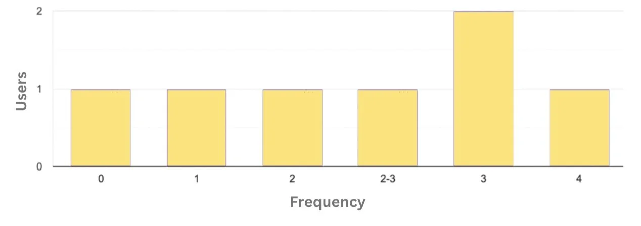
In a week, how often do you walk home at night?”
85.7% of participants walk home from campus at least once a week.

“How safe do you feel walking home?”
57.1% of participants rated a 3 or lower (on a 1-5 scale, 1 being not safe at all). Also 71.4% of participants reported carrying some type of self defense weapon.
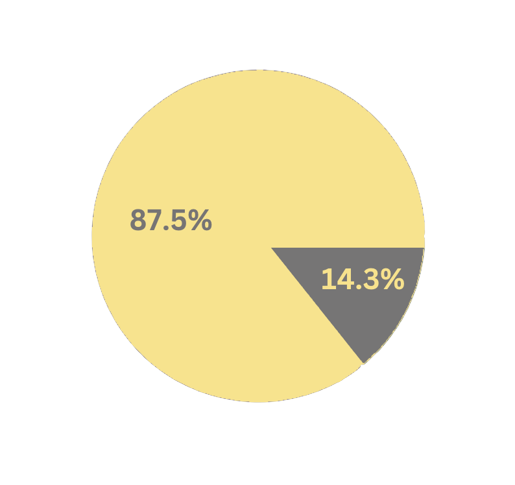
“Do you know the location of the closest blue light safe post?”
85.7% of participants responded “No.”
Personas & Task Descriptions
Age: 18
School Year: Freshman
Housing: Dorm Hall
Julia (she/her)
‘Julia’ is a freshman at the University of Minnesota. She lives in a dorm hall that is located in Superblock, so she often has to walk past the Lightrail station on her way back to her dorm after evening classes. More often than not, Julia is walking alone after sunset. There has recently been an increase in robberies near the Lightrail station and she is looking to increase her personal safety when traveling at night across campus as a woman.
-
Julia often finds herself walking home late at night after class. During these experiences she rarely feels safe– especially after hearing about increased crime near the light rail stations. This is a big problem for her as she wants to feel like the campus supports her safety. Julia’s task is to get herself home from campus safely after her classes.
Age: 22
School Year: Graduate Student
Housing: Off-Campus Apartment
Tyler (they/them)

‘Tyler’ and their partner live together in an apartment off-campus. Tyler’s partner is a research assistant and due to the nature of their work, Tyler’s partner may be on campus as late as 11p.m. before walking home. Since neither of them own a car, Tyler cannot pick up their partner from the lab. Therefore, Tyler is looking to check up on their partner while they walk home to ensure that they are safe and not near any crime-related events.
-
Tyler often feels anxious waiting for their partner to get home, not knowing the type of environment the streets will be in that night. They face the problem of not knowing exactly where their partner is and whether where he is is safe or not. Tyler’s task is to track their partner on his way home, allowing them to see live location and safety updates while their partner is on his way home.
Age: 20
School Year: Junior
Housing: Commuter
Arianne (she/her)

‘Arianne’ lives with her mother in a house located in the Minneapolis suburbs, so she commutes to campus daily. She parks in a parking garage near campus. Her mother often worries about Arianne walking by herself to the parking garage, so Arianne usually texts her mom when she leaves campus, and when she arrives at the parking garage, as she doesn’t like using her phone while walking. Her mom wishes there was more convenient way of being notified that her daughter has made it to her car safely.
-
Arianne has not personally felt unsafe on campus, but her family members have as she is in a much bigger city going to school. It would be nice for Arianne’s mother to be able to know about her whereabouts without Arianne feeling like she has to constantly keep her informed- taking away from Arianne’s safety, especially if she is walking alone. Arianne’s task is to inform her mom she is safe in a hassle free way on both ends.
Initial Prototypes
This series of 6 wireframes showcases a detailed version of our initial paper prototype (far right). These 6 wireframes were created using Adobe Illustrator, while the paper prototype was created on a post-it note- to aid in idea generation.
To meet the user needs, this application includes:
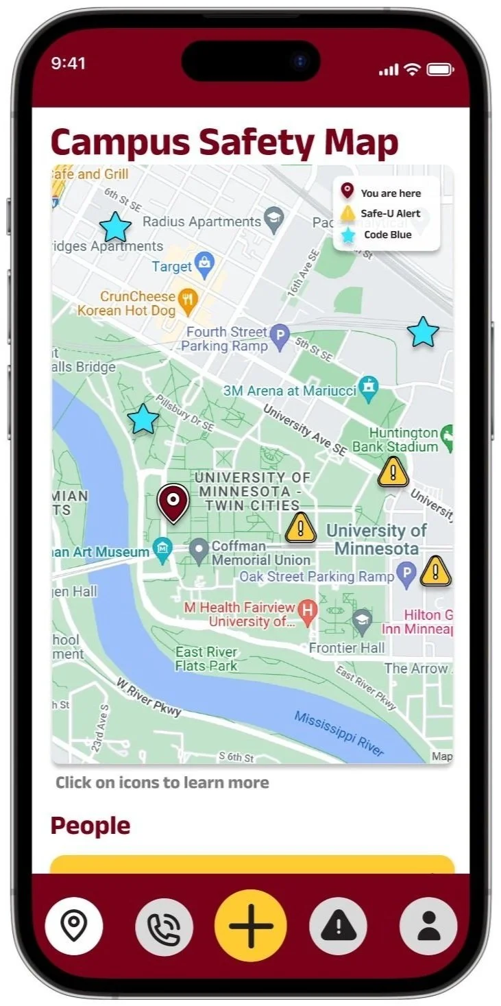
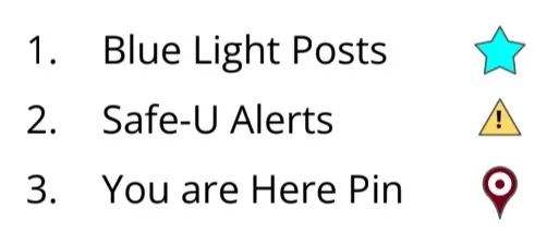
1) Live map that includes code blues, safe-u alert locations, and user locations.
2) Campus resource page with all numbers and external resources readily available.


Feedback Round 1: Peer Feedback
One of our key takeaways from peer feedback (below) was that a universal design of icons was necessary for accessibility. This feature, along with the legend, has been updated since the initial paper prototype (immediate right), and is included in the final Figma Prototype (far right).


Feedback Round 2: Cognitive Walkthrough
A cognitive walkthrough is a type of feedback mechanism where a user walks through the paper prototype using a user persona and their task description. In order to understand pain points, we rated the difficulty of specific actions to get a better sense of this apps ease in usability. This can be seen through the tables (below).

Feedback Ratings: Julia’s’ Persona & Task Description
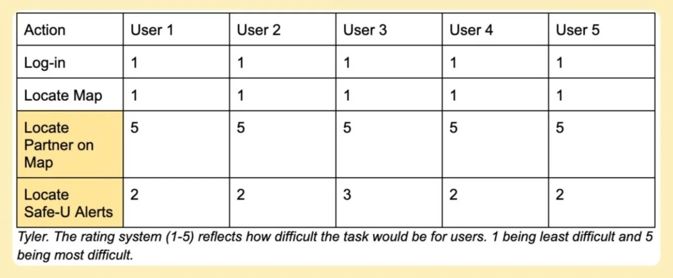
Feedback Ratings: ‘Tyler’s’ Persona & Task Description
The two main points of feedback: 1) It is not obvious users can interact with icons such as pins on the map. 2) It is hard to locate friends on the map unless users drag manually.
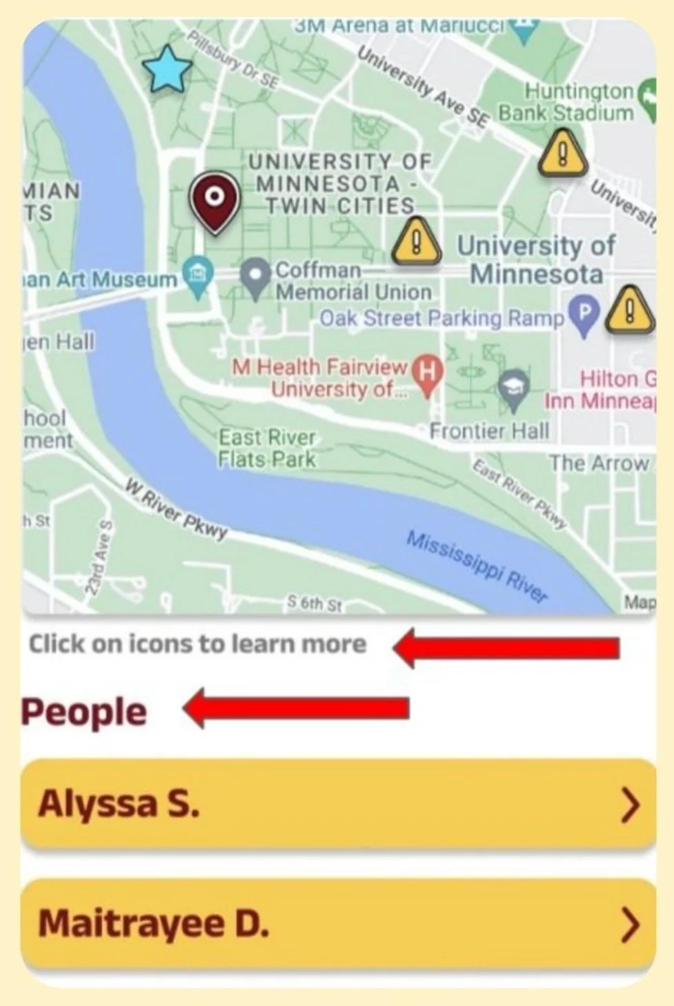
In our final Figma Prototype, a peoples tab to track friends was created, and we also added a small text box to make users more aware of the clickable icons.
Feedback Round 3: Heuristic Evaluation

Using “Nielsen's 10 Usability Heuristics” as our metric, each team member identified problems in the prototype in accordance with the given heuristics. During these walkthroughs, we identified potential issues with varying severities, the main ones in the table (right).
High severity concerns: Error prevention category (highlighted above). Overall, we were able to identify around twenty problems in our current interface that we otherwise would not have considered, this table highlights the main ones.
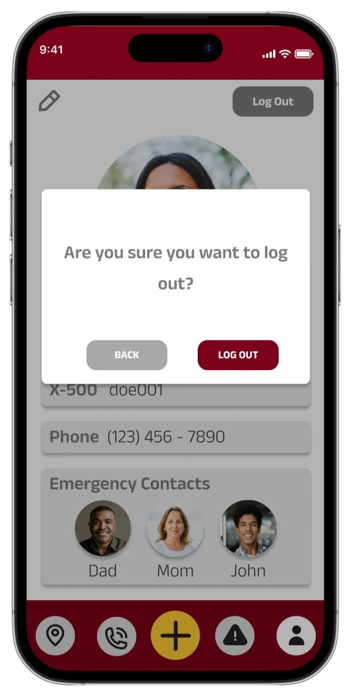
To aid Error Prevention: a confirmation message now appears upon clicking the ‘Log Out’ button, this is on the settings page.

To provide clear system feedback: there is now a feedback message that is displayed if the user submits a report.
Feedback Round 4: Live User Testing
After completing a more thorough figma prototype based on previous feedback, we conducted 3 live user tests.
We noticed consistent feedback in terms of user needs and learned that users value easy accessibility to the necessary information in an efficient manner, especially given the context of insuring safety at any moment the users might need it.
-
During this session, we were able to watch one of our users explore our interface. At the beginning of the session, we did experience some logistical issues regarding the permissions of the prototype. This was a problem, but it was easily remedied by giving the user the correct permissions, as opposed to simply sharing a link to the prototype. Our first step was to allow the user to explore the interface without any prompts. She mentioned a few issues pertaining to the implementation of certain things. For example, we were able to spot areas in the prototype where things did not work (e.g. scrolling, expanding cards, etc.) When presented with the given tasks, she was able to complete all of them. She mentioned that she found all the tasks to be intuitive and easy to execute. With respect to suggestions, she mentioned that it would be nice if the resources page allowed the user to call numbers directly. Furthermore, she anticipated that the resources page would be her most used feature. Finally, she informed us that our app meets and exceeds her expectations for a campus safety app.
-
Through our second user testing session, we were able to gain additional insight into the overall user experience. As the user voiced their thought process while exploring the application initially, we were able to observe their first-hand impressions about the design. They pointed out that from the very start, the campus map helps familiarize users with the locations of code-blue posts - something they usually would not have kept in mind prior to this. Other features such as the phonebook and Safe-U alert history consolidated useful information in one place. As we asked Medora to complete some of the tasks, however, some potential areas for design improvement began to emerge. For example, she pointed out that not all of the resources in the phonebook had the contact number listed directly under it - users had to click an additional link to seek that information. This inconsistency in design could potentially cause confusion among users. In addition, it was not immediately clear whether clicking on a friend’s name would highlight their location on the campus map. Similarly, the user pointed out that having emergency contact information in the profile page may not be intuitive, and in order to be consistent, this information could be presented in the home page (where the friend messaging system would ideally be set up).
-
Our third user-testing session gave us an alternative opinion on the placement and functionality of some of our features. While the task of locating the Safe-U Alert tab in the app proved to be decidedly ‘easy’ for the user, the task which asked him to ‘report an incident’ proved to be less intuitive. Although there were difficulties navigating the ‘+’ tab, he mentioned that the use of the ‘+’ symbol made sense. He believes that whatever is in the center of the navigation bar should link to whatever feature people may want to use most– whether that be the map or the reporting feature (but only if the reporting feature was akin to an ‘SOS’ button). The longer entry boxes in the ‘report an incident’ tab implies that this feature should not be used during the emergency, but afterwards instead. This means that this feature may not be as useful as one thinks. Similarly to the previous user’s comments on the map, this user believes that the common user should be able to see their friends on the map as well as being able to see their ‘location’ listed under their profile on the map page. As for emergency contacts and resources, he believes that there should be functionality that allows the user to directly call Gopher Chauffer and emergency contacts directly through the application.
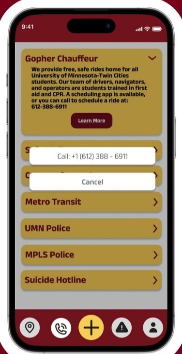
One of the primary takeaways from our user testing was the need for a Call button in the Resource tab. This is necessary since emergency contacts should be easily accessible.
These testing sessions also highlighted the fact that most users would prefer to also use this application as a contact hub for their friends and other resources on campus. In either situation, a call button is necessary (implemented on left).
Feedback Round 5: Professor Feedback
This final figma prototype was presented to the class at the end of the course. During this presentation, we received even more feedback from a multitude of professors and students.
Key takeaways from this session of feedback :
1) In a safety application location sharing is really important, and the control of it is more important.
2) Currently there is no easy, visible way to add new friends on your map.
In order to solve the first issue with safety, we added a location sharing toggle, for users to be aware if they are sharing their location or not (implemented on the near right).
To make adding friends easy, the last button in the people’s list is an add friends option (implemented on the far right).


Implementation Summary & Future Plans
For our team, the overall goal was to create an application that ties in University and non-Univesrity safety resources to help community members navigate campus in a more informed way. Through initial user research, we developed a prototype that displayed a campus map with useful information such as the locations of code blue posts and Safe-U alerts. From peer review feedback, we changed the color and symbolic representation for these icons to be more accessible for users with color blindness. From the cognitive walkthrough, we also realized that our initial implementation of the campus map did not support an easy way to locate friends’ locations. So, we introduced a dropdown that enables users to look up friends more easily. We also introduced a confirmation message after submitting an incident report to adhere with heuristic guides for interface design, and added a ‘Clear’ button to allow users to start a new report more easily. Due to a location privacy concern that was voiced in the final presentation feedback, we also added a toggle button on the map page so that users can control when they are sharing their location with others. Other implemented changes from the presentation feedback include: an ‘add friend’ button on the map page, adding a disclaimer message when adding a friend telling users that thier location will be shared, and having the user’s location listed under ‘people’ on the map page.
Some future implementations include making the campus map interactive/movable such that it captures both the Minneapolis and St. Paul areas of the University, allowing users to type/delete text in the fields (login page, report page), and providing users with real time info on where the closest Safe-U/Code Blue post is located.